In Loco Parentis
In Loco Parentis is a documentary investigating the worldwide impact of dysfunctional parenting. The film aims to understand why authorities continue to disproportionately invest in post-trauma responses to victims of parental child maltreatment rather than investing in more cost-effective and humane preventative initiatives. The documentary is composed of interviews with professionals and individuals relevant to the subject coupled with a series of animated sequences.
I undertook In Loco Parentis as a pro-bono side project, serving as the art director and animation team leader. I was responsible for developing the documentary's visual identity and producing the animation sequences while leading and mentoring a team of seven junior motion designers and frame-by-frame animators.
DIRECTOR
Daniel Einfeld
Masters of Research/PhD candidate at Macquarie University
YEAR
2020-2021
ROLES
Art direction
Illustration
Motion lead
Team management
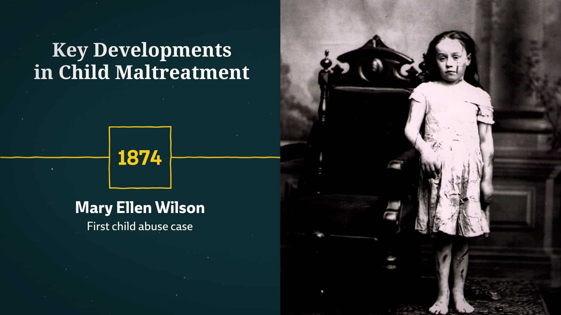
The term In Loco Parentis, Latin for "in the place of a parent", refers to the legal responsibility of a person or organization to take on some of the functions and responsibilities of a parent. [wikipedia]
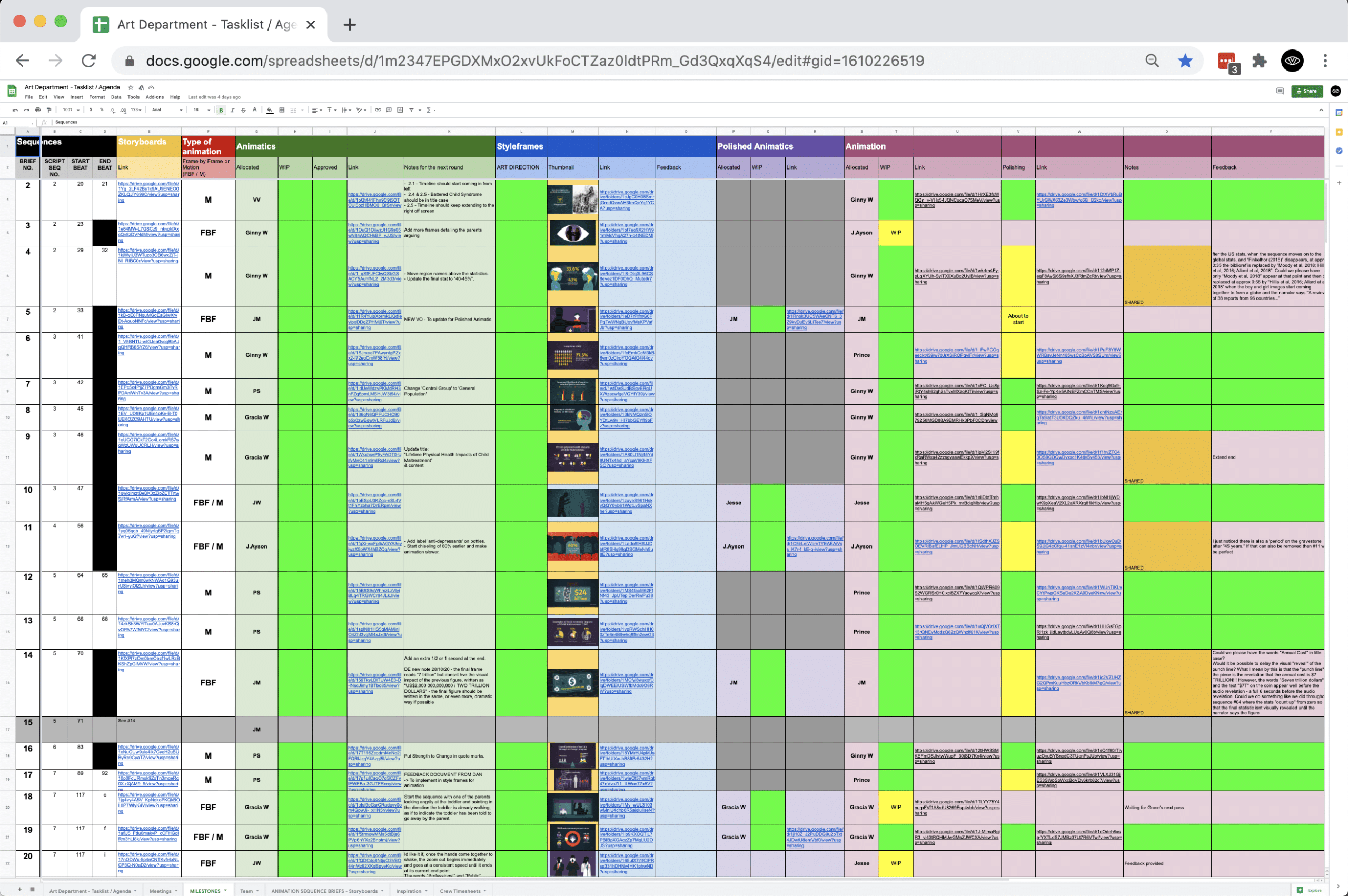
As the project started in 2020 in the midst of the coronavirus pandemic, our team worked remotely and all collaboration was made online through video calls, chats and shared documents. To keep our team organised, I set up multiple documents to keep track of our progress and streamline communication.
Here is our milestones tracker that provides comprehensive information about the 19 animation sequences. It includes details about the relevant segment of the script, the animator assigned to each sequence, the current production stage, any feedback given and the necessary actions to be taken.
Illustration style
“Less is more” and “an image is worth a thousand words” are two adages that drove the illustration style. I think that it is very powerful to use a minimal amount of details but to feature strong, metaphorical elements that allow the audience to focus on these visual metaphor and to understand them easily. After all, the animation is here to support the content of the script and should help the viewer understand the concepts narrated by the voice-over.
Character design
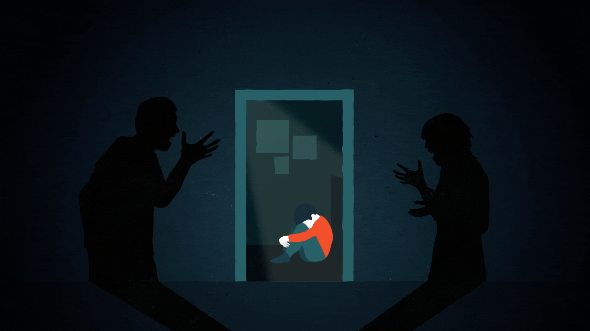
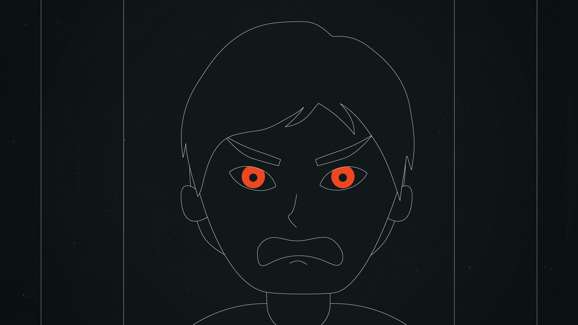
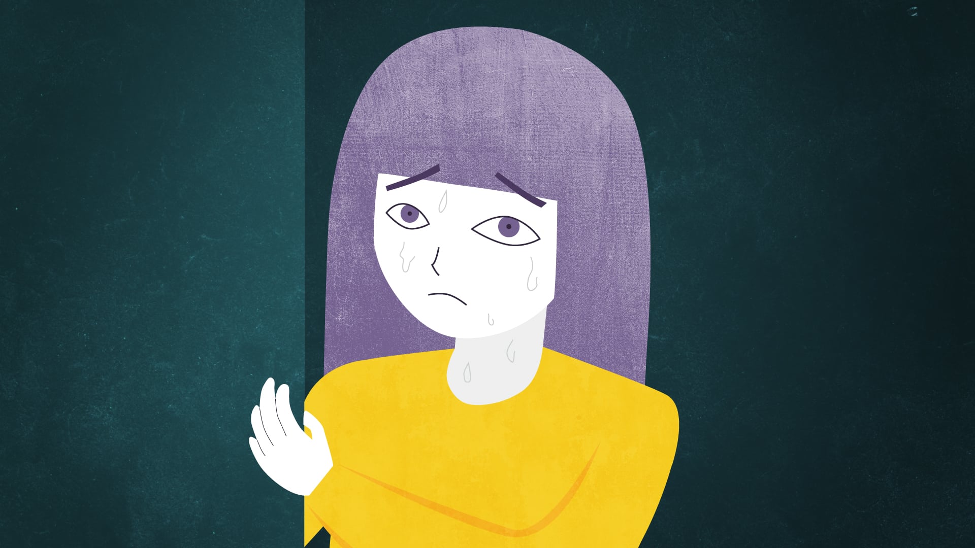
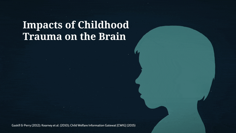
As we depicted personal stories and anecdotes recounted in interview but also wanted to preserve the subject’s anonymity, I thought that it would be appropriate to create characters with limited amounts of details. That way, not only the characters would not be identifiable, but it could also lead to more people being able to relate to them.
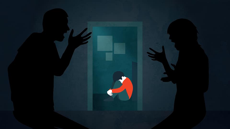
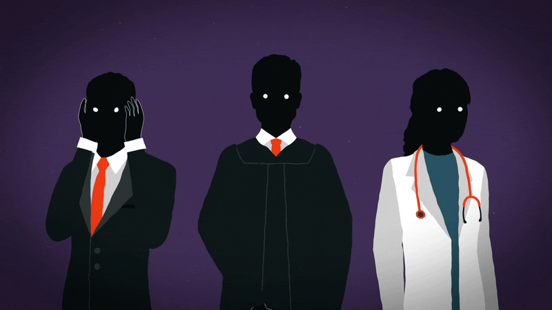
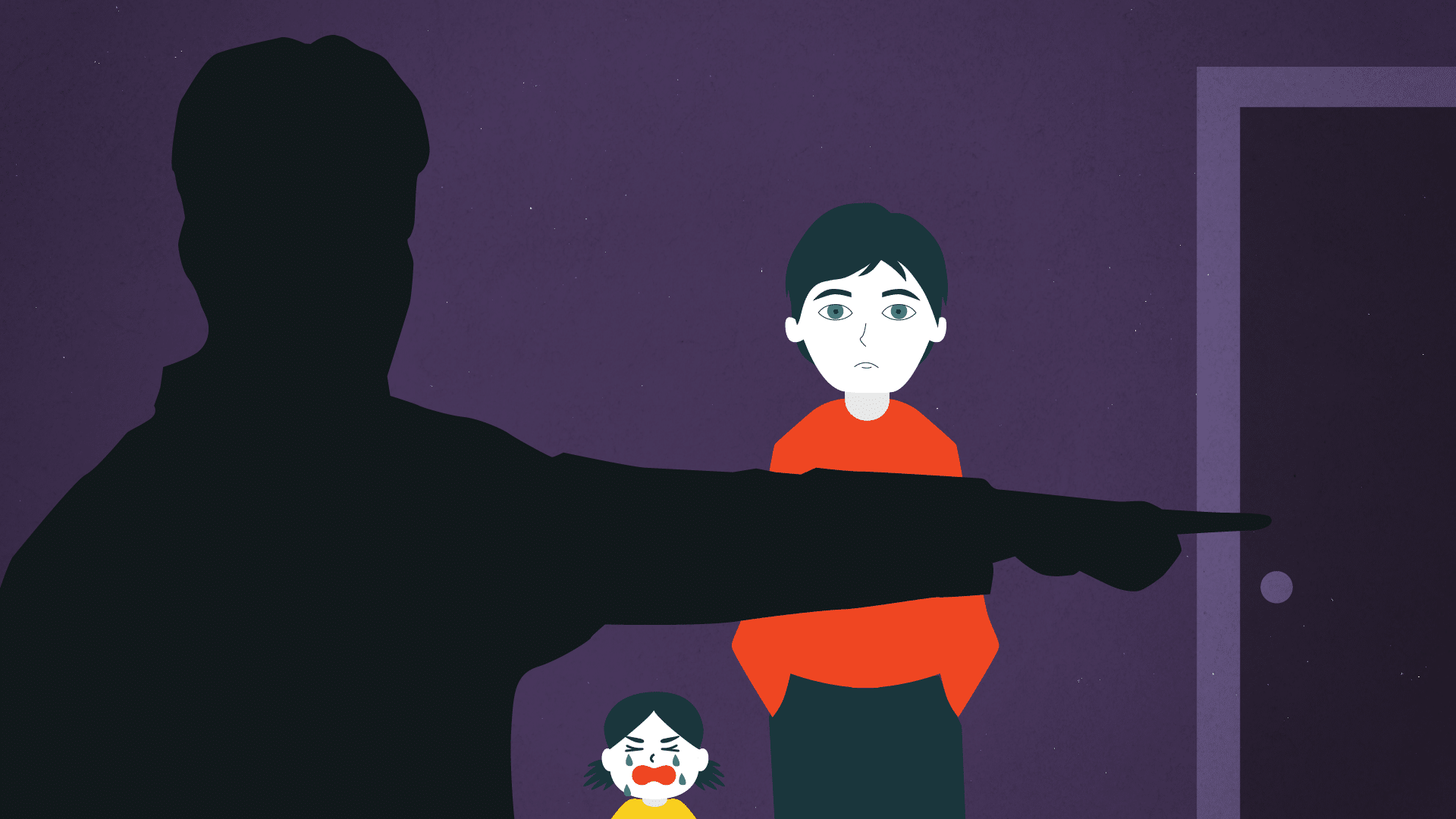
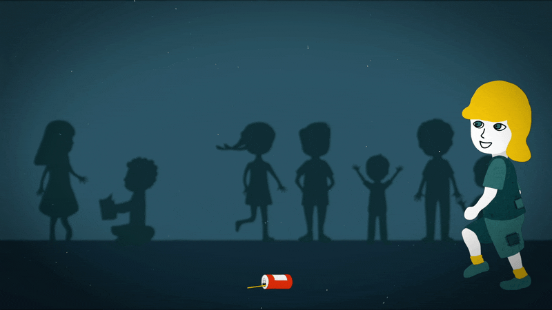
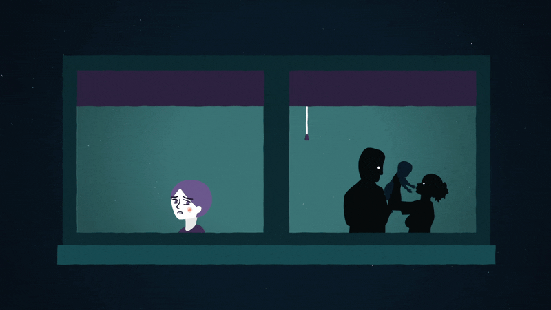
I liked the idea of having the children drawn with a couple of facial features and colours, while the abusers of their life were represented by silhouettes.
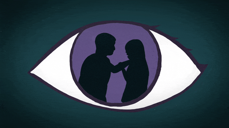
Shadows and silhouettes
Child maltreatment has a long-lasting psychological impact on the victimes. As this is a consequence that is often invisible to the eyes, I wanted to experiment with the use of shadows and silhouettes, setting our universe in a world of memory, dreams and imagination where we enter our narrator’s headspace.
The shadows had multiple meanings, such as representing a nightmare-like experience from the victims or showing that appearances can be misleading and that what happen behind close doors can be significantly different from what you see as an outsider.
Colour and tone
Given that the subject of the documentary is a serious and heartbreaking matter, I thought that it was suitable for the colour palette to be dominated by dark values and tones. However, everything is not gloom and doom. In contrast to the dark tones, I wanted to introduce a couple of accent colours to highlight our key elements and represent a notion of hope and brightness, despite the heavy subject.
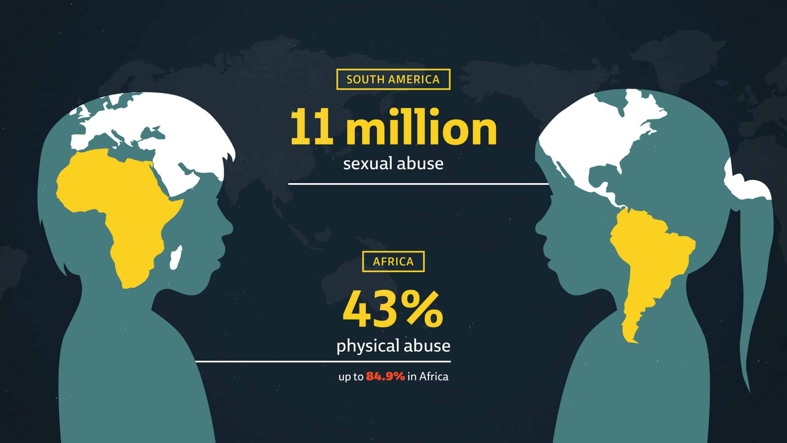
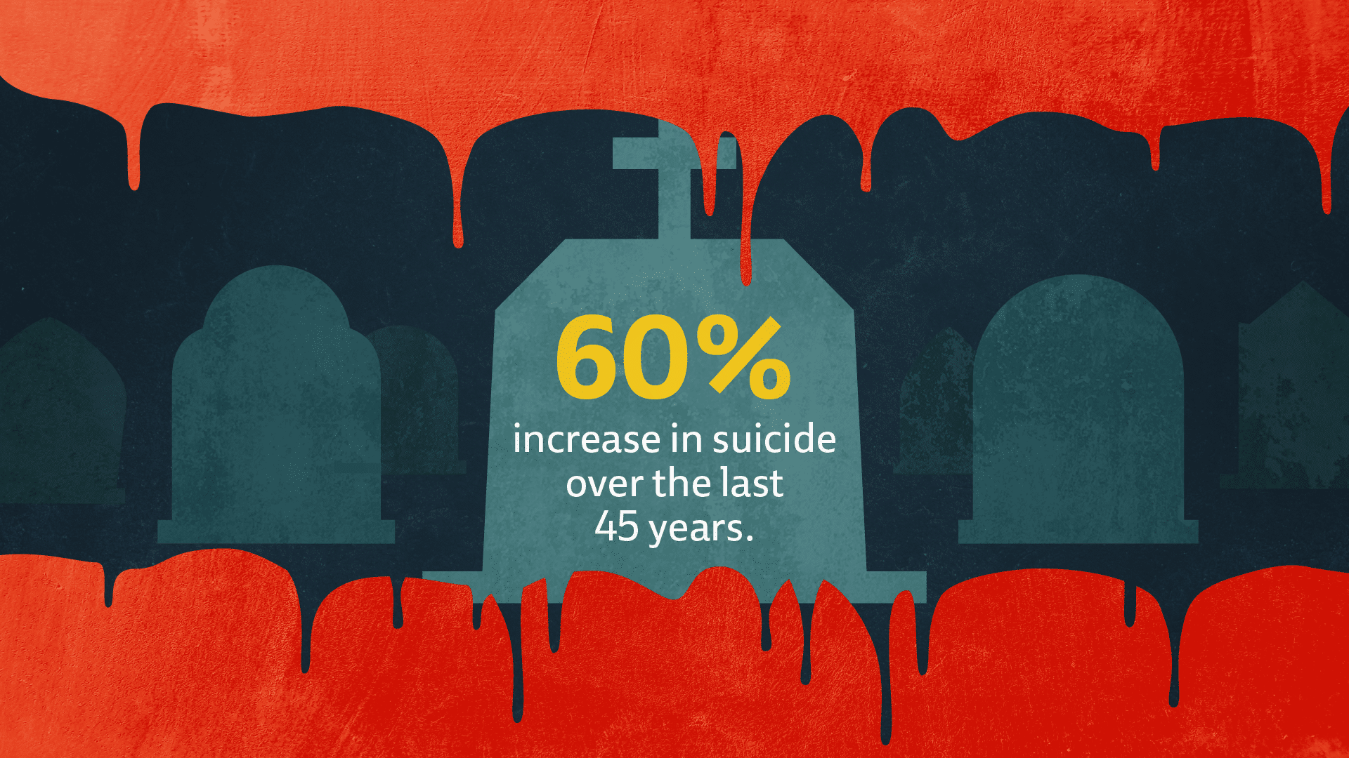
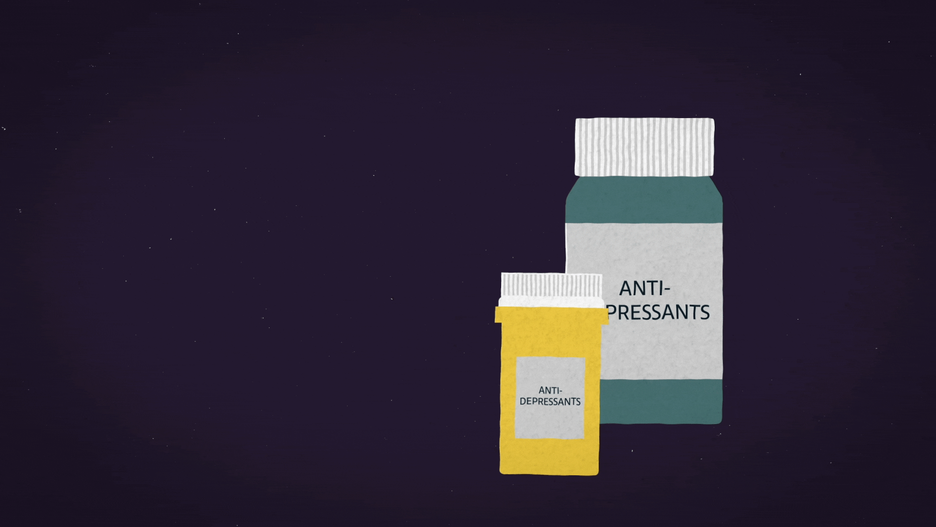
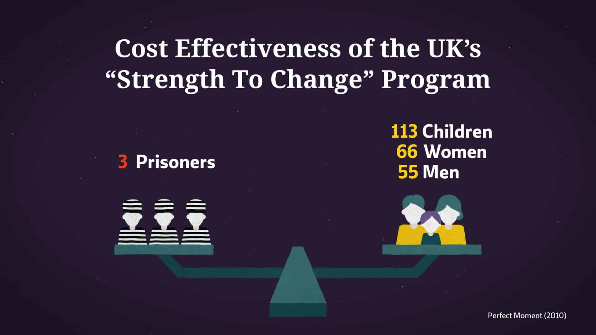
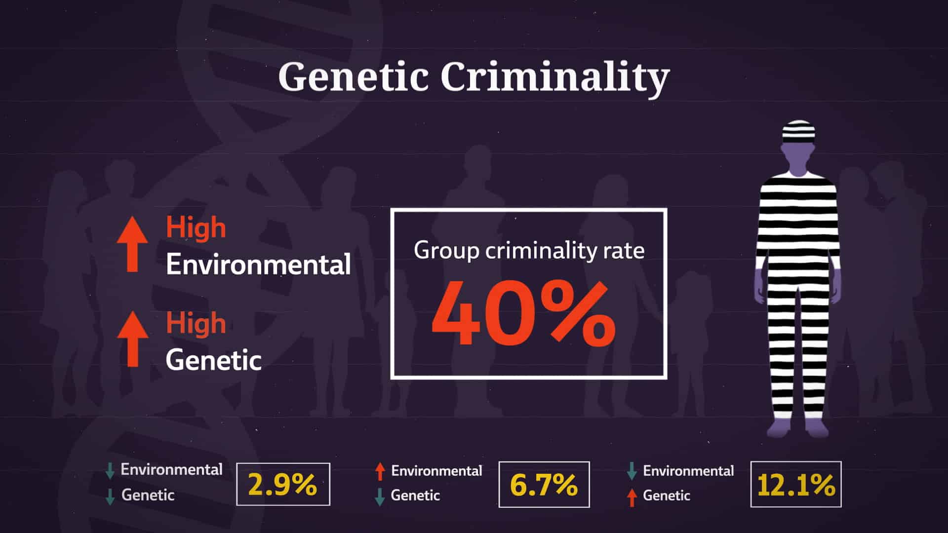
Data and statistics
Complex concepts, facts and date can be difficult for the audience to understand by just listening to a voice-over. We created a series of moving infographics to visually represent these concepts and data, to support them and help the audience comprehend their meaning.

Textures
As our universe revolves around the context of headspace and mental representations, we included some textures in our illustration and animation, such as watercolour stains, paper-like materials and old film grains. The textures gave the illustrations some depth and intricacy.